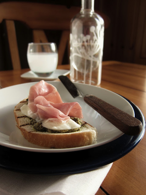
No matter how hard I tried I could not get that washed out look in the original photo. I tried doing a little tweaking of the photos by reducing the saturation. I thought brightening the photo might help, but it didn't. Thinking back on it my ISO was set really low, it should have been much higher, probably as high as it could go. I really like the light on the first shot up top, but the photo was just too clear. Also, the photo focuses more on the bottle and less on the bruscetta. My chairs are much taller than the chairs in the original photo. I debated raising up my table, but then decided it wasn't that important. My background was also much darker than the original.
In the end, the photo below is the one I felt came closest to the original. I managed to blur out the background a bit and I think the angles were the closest of any I shot as well. They were still a bit off, but closer than any others I took.Once I was done I was actually pretty happy with how the final shot turned out. I hadn't anticipated even coming close. Now, I can say that I am happy that I challenged myself to participate this month. I also rarely take photos on this table and I now see that there might be some possibilities in the future. Even though the challenge is about trying to re-create the photo of someone else, I actually think this feels more like my home than many others I take on this blog. Again, thanks to Simone for hosting the Donna Hay Food Styling and Photography Challenge. See details on the challenge below.
 The Donna Hay Styling and Photo Challenge is sponsored by Simone at Jungle Frog Cooking. Anyone is welcome to participate at any time. I recommend it as a way to think about how you take photos and set them up. Each month a different photo is chosen by Simone from a Donna Hay Magazine. This months challenge was Bruschetta with Arugula Pesto, you can find the challenge along with the recipe at the link above. This months photo was from Donna Hay's Seasons Cookbook, the photographer was Con Poulos. You can see the side by side comparison below, the original Con Poulos photo is on the left and my interpretation is on the right (like I needed to clarify that).


O but that is a pretty good effort Nicole! Despite almost not making it.. ;) I'm glad you found the time to do participate as I think you've done a good job here. Both the images have a similar feel to them. Sure the props are not the same (but no one had the same props as Con Poulos's shot) but it's all about getting the feel right and you nailed that one!
ReplyDeleteI really like your version! Double stacking the plates was a great idea, it definitely gives a similar feel - also love your wooden handled spatula - I also found a need to do some improvising with this one, like you can't go out buying new dining room tables :)
ReplyDeleteThis looks absolutely delicious. Would love for you to share your pictures with us over at foodepix.com.
ReplyDelete